













AI Image Colorizer Settings Guide: What Each Option Does
An AI image colorizer can do much more than apply automatic color to a black-and-white photo. The right tool can interpret a faded family portrait differently from a manga panel, protect ink lines, preserve speech bubbles, follow a written color brief, or use another image as a color reference.
EzEnhancer AI Image Colorizer separates those decisions into four content modes—Photos, Manga & Comics, Line Art & Sketches, and Illustrations & Art—then shows controls suited to each type of source.
This guide explains what every major button does, how different settings are likely to affect the result, and which combinations make sense for common projects.
Quick answer: For a typical black-and-white photograph, start with Photos → EModel → Photo → Natural → Automatic. Use a prompt when specific objects need specific colors. Use a reference image when the main subject must match an existing character, product, or wardrobe palette.
The Complete Workflow at a Glance
- Choose Photos, Manga & Comics, Line Art & Sketches, or Illustrations & Art.
- Select Upload Your Image or Add images and upload a JPG, PNG, or WebP file up to 18 MB.
- Choose an AI model and, when available, its quality or resolution level.
- Configure the content-specific controls, such as photo type, palette, line protection, background treatment, or shading.
- Choose Automatic, Describe Colors, or Reference under Color Guidance.
- Select PNG, JPG, or WebP as the output format.
- Select Colorize Image, review the result, and download the approved version.
The current AI image colorizer interface allows free users to add one image at a time, while the VIP panel supports up to ten. The number shown on the action button is the estimated credit cost. Because product limits and pricing can change, check that live number before submitting a job.
First, Choose the Right Content Mode
Content mode is not simply a label. It tells the model whether to interpret grayscale values as photographic light, manga screen tones, sketch marks, or painted texture. Choosing the wrong mode can produce muddy lines, overly realistic artwork, cartoon-like skin, or aggressive background color.
| Mode | Best for | Main controls | Avoid using it for |
|---|---|---|---|
| Photos | Black-and-white photos, old prints, faded photos, film scans, portraits, historical images | Photo Type and Color Palette | Clean line art or manga pages |
| Manga & Comics | Manga panels, comic pages, anime drawings, artwork with speech bubbles | Rendering, line protection, background, shading, and text handling | Photographic portraits |
| Line Art & Sketches | Character drawings, product sketches, scene outlines, design drafts | Subject type, fill style, line protection, background, and shading | Tonal paintings with little visible line work |
| Illustrations & Art | Digital art, traditional art, concept art, and children's drawings | Artwork type, palette, rendering style, and lighting | Historically sensitive photo restoration |
When the category is unclear, judge the image by its visual language rather than its subject. A portrait with lens-based light and realistic texture belongs in Photos. A character drawn with ink contours belongs in Manga or Line Art. A grayscale painting with complete brushwork belongs in Illustrations & Art.
How to Choose an AI Model
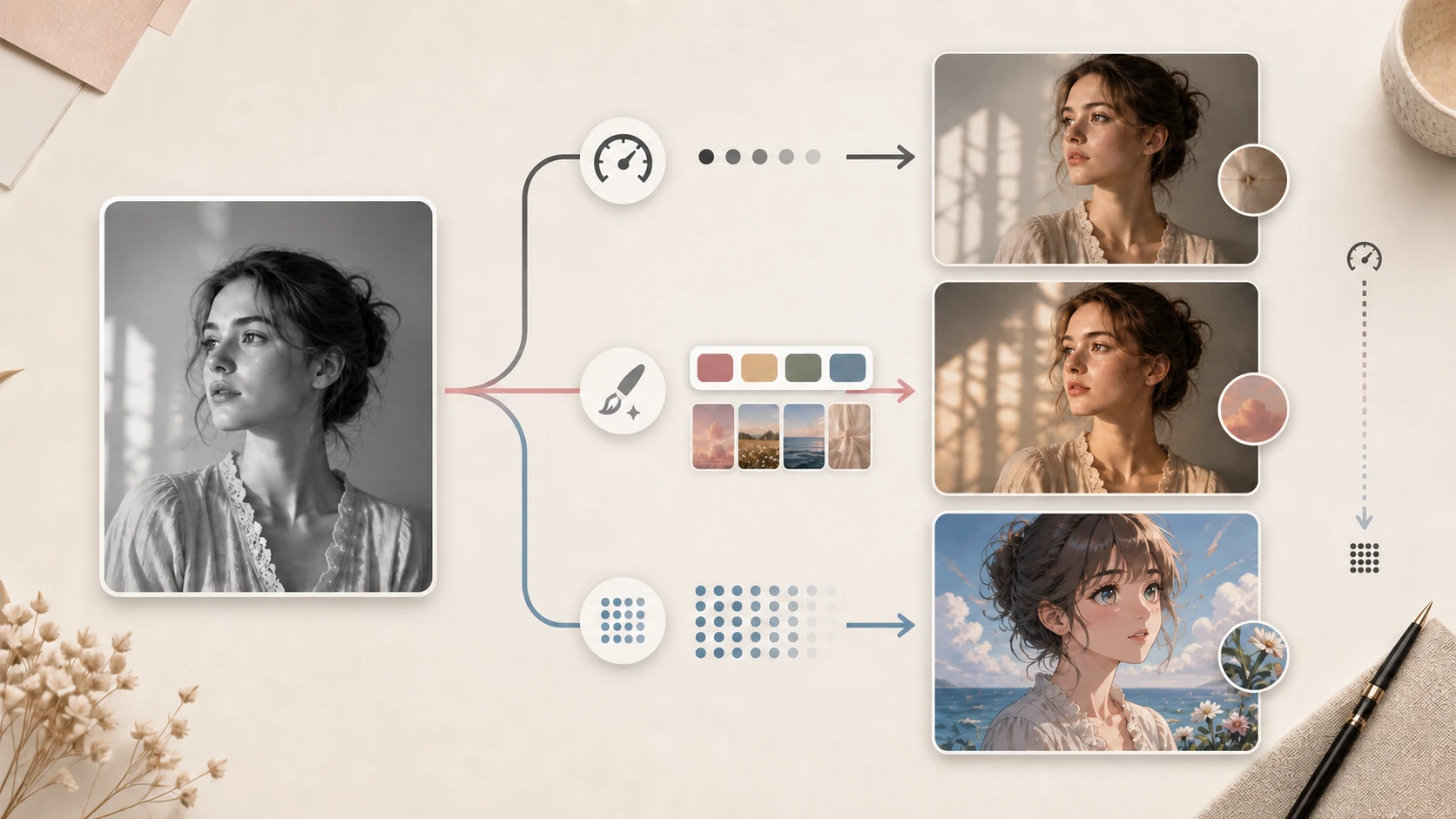
The model affects speed, credit cost, instruction-following, reference support, and output size. EzEnhancer currently presents the following combinations.
| Model | Available content modes | Current levels and credits | Main advantage | Recommended use |
|---|---|---|---|---|
| EModel | All four modes | 5 credits | Fast, faithful colorization at a lower cost | First passes, automatic color, routine photos and drawings |
| GPT Image 2 | Photos, Line Art, Illustrations | Low 6 / Medium 10 / High 20 credits | Stronger interpretation of detailed color instructions and reference images | Complex people, materials, products, or creative direction |
| Nano Banana 2 | Manga & Comics | 1K 5 / 2K 8 / 4K 12 credits | Manga-focused path with selectable output resolution | Comic panels, character art, and larger manga exports |
EModel: Build a Baseline First
EModel is the practical starting point when you do not yet know which settings matter. It has no separate quality menu, supports Automatic and Describe Colors, and is currently the least expensive path for most tasks.
Use it to answer two questions: Did you choose the right content mode? Is the selected palette or rendering style appropriate? If the answer is no, changing the content settings usually helps more than immediately choosing a more expensive model.
EModel does not expose Reference guidance. Choose another supported model when a subject must match an existing color source.
GPT Image 2: Use It for More Detailed Direction
- Low: useful for testing a prompt, palette, or composition at a lower credit cost.
- Medium: a balanced starting point for important results and moderately detailed instructions.
- High: best reserved for intricate people, products, materials, or cases where the lower tiers still show color spill or weak instruction-following.
A higher level cannot correct a category mistake. If a drawing has dirty edges, verify the content mode and Line Protection setting before moving from Medium to High.
Nano Banana 2: The Resolution-Based Manga Route
- 1K: quick character color tests, drafts, and social previews.
- 2K: individual panels, character sheets, and normal digital publishing.
- 4K: larger displays, detailed review, print-oriented work, or later cropping.
Nano Banana 2 currently excludes WebP from the output choices, so select PNG or JPG when using this model.
Photos Mode: What Every Setting Does
Photos mode contains two main groups: Photo Type and Color Palette. Photo Type tells the model what kind of photographic evidence it is reading. Color Palette controls the overall color character rather than exact object colors.
Photo Type
| Option | Likely effect | Best use | Practical advice |
|---|---|---|---|
| Photo | General-purpose, balanced photographic color | Everyday black-and-white street, interior, or landscape photos | Start here when no specialist category applies |
| Old Photo | Interprets aged portraits, clothing, and period-looking scenes | Scanned albums and early portraits | Repair tears and scratches before colorization |
| Faded Photo | Recovers weak residual color and overall color balance | Color prints that have faded, yellowed, or lost saturation | Do not use it as the first choice for clean monochrome photography |
| Film | Preserves a more atmospheric, film-like relationship between color and grain | Film scans, cinematic street images, archival negatives | Useful when mood matters more than vivid saturation |
| Portrait | Prioritizes skin, hair, clothing, and facial regions | Individual and group portraits | Use when the person should dominate a complex background |
| Historical | Encourages a more restrained treatment of period imagery | Archives, historical scenes, uniforms, and old architecture | Treat the generated colors as hypotheses, not proof |
If an old scan contains tears, creases, stains, or missing facial detail, begin with AI photo restoration. Clean structure gives the color model better edges, fabrics, and facial features to interpret.
Color Palette
| Option | Visual direction | Recommended use |
|---|---|---|
| Natural | Restrained saturation and plausible skin and environment colors | Family photos, documentary work, and first tests |
| Vivid | Stronger saturation and more prominent subject colors | Social posts, products, and modern scenes |
| Warm | More orange, gold, and warm pink influence | Sunsets, interiors, family moments, and warm light |
| Vintage | Softer, aged-print, or period-inspired color relationships | Old photographs and retro editorial treatments |
| Cinematic | Stronger warm-cool contrast and dramatic separation | Film-like portraits, urban scenes, and concept visuals |
| Pastel | Lighter, softer, lower-contrast colors | Weddings, children, lifestyle imagery, and gentle visuals |
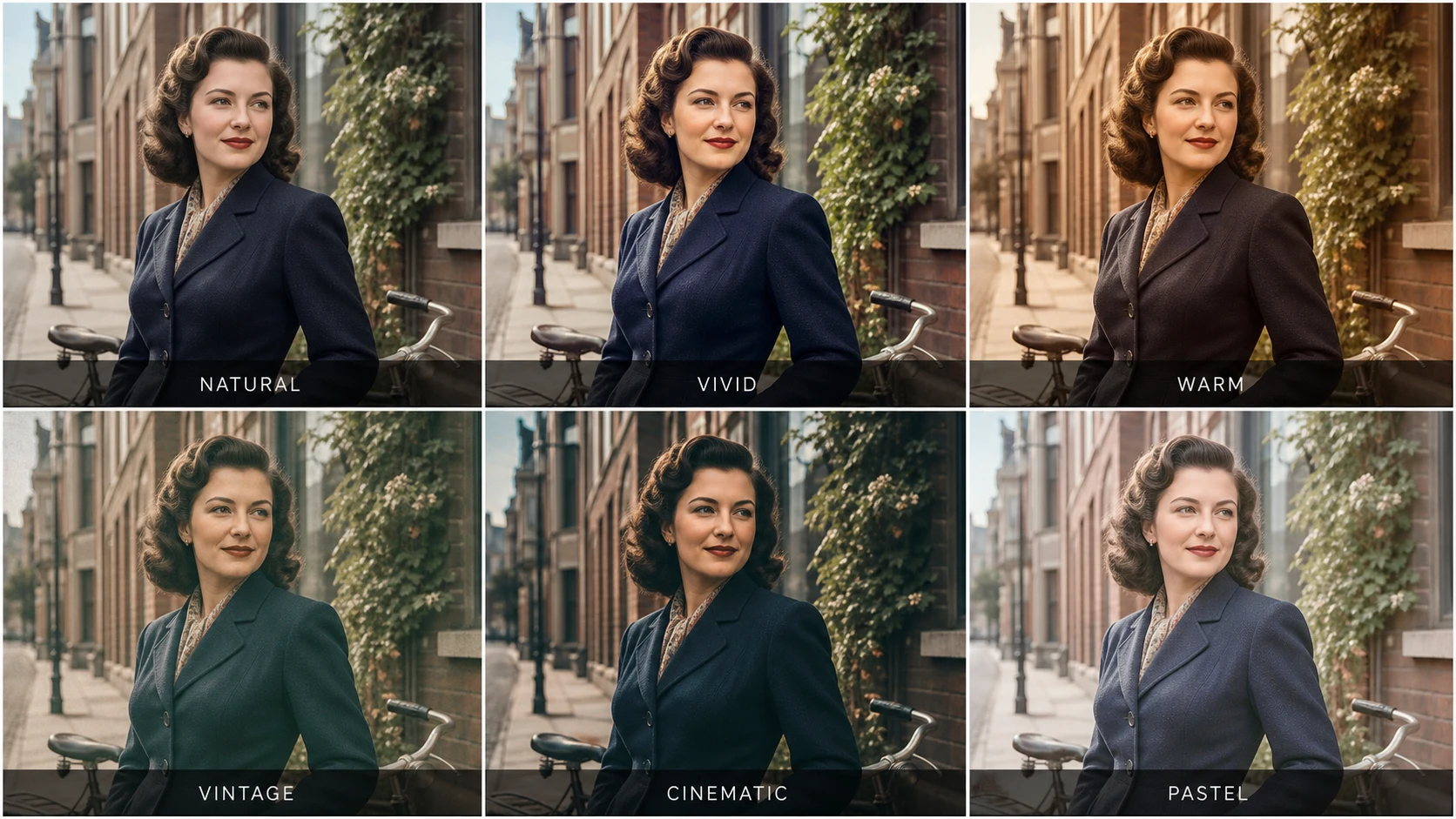
Palette comparison: the portrait, pose, crop, and background stay consistent while the global color treatment changes. Natural remains restrained, Vivid increases separation, Warm adds golden tones, Vintage softens the print, Cinematic deepens warm-cool contrast, and Pastel lowers contrast.
A palette preset is a global direction. It does not guarantee that one jacket becomes navy or one car becomes red. Use Describe Colors or Reference when an individual object needs a controlled color.
Manga & Comics Mode: Protect Lines, Text, and Continuity
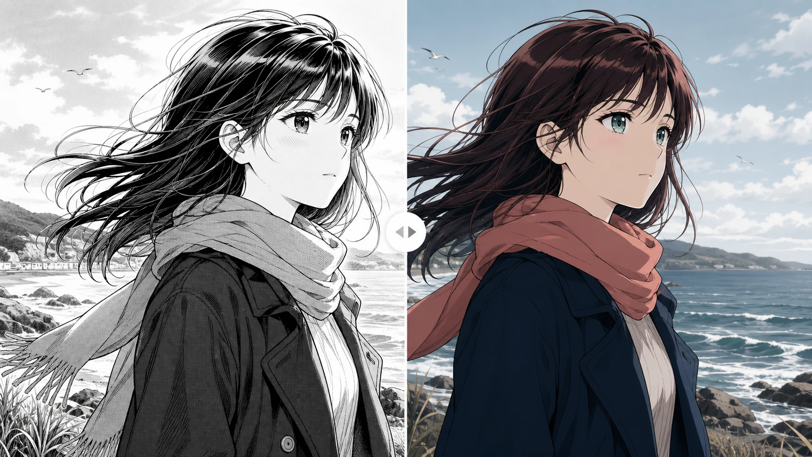
Manga colorization has three priorities: clean ink, readable text, and consistent character colors. Reference-guided manga coloring has been studied for precisely this reason. The Comicolorization research paper describes using character references to help maintain colors across multiple panels.
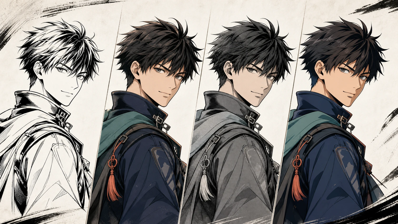
Rendering Style
- Cel Shaded: clear light-and-shadow regions with an anime finish. This is the default Manga setting and suits character art and action panels.
- Flat Color: clean base colors with less shading. Choose it for character sheets, Webtoon base layers, or later manual painting.
- Soft Anime: smoother transitions and gentler lighting. It fits romance, slice-of-life, and softly lit character work.
- Vintage Manga: a more retro printed or aged-color direction for period stories and cover art.
Line Protection
- Strict: protects ink contours aggressively. It is the safer choice for finished pages, fine line art, and images containing text.
- Balanced: allows color and shading to blend more naturally with the drawing. It works better for thick lines or illustration-like manga.
If color bleeds across ink edges, switch from Balanced to Strict. If the result feels like hard stickers with little integration, try Balanced.
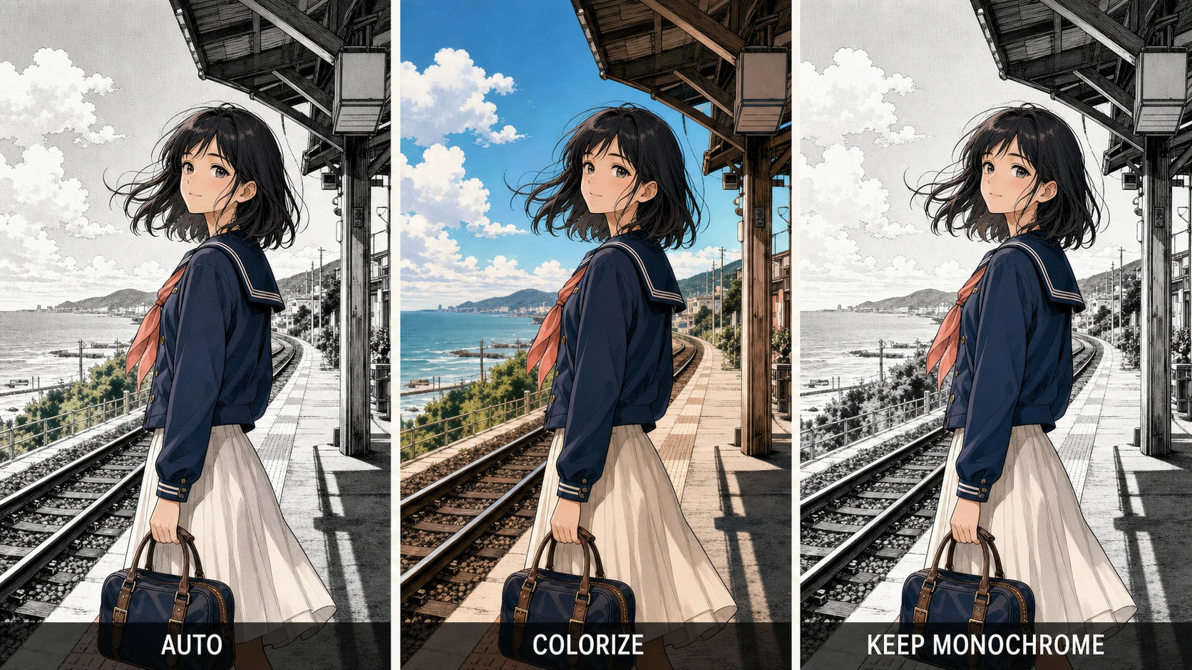
Background
- Auto: lets the model decide whether and how much of the background should be colored.
- Colorize: actively adds color to the environment. Use it when setting and atmosphere matter.
- Keep Monochrome: preserves a black-and-white background, creating a selective-color effect around the main subject.
Shading
- Original: follows existing screen tones, grayscale, and shadow structure as closely as possible.
- Soft: introduces smoother light transitions.
- Cel: creates more graphic shadow shapes for an animation-like result.
Text Handling
- Preserve: prioritizes speech bubbles, sound effects, and other text areas.
- Color Around: colors the surrounding artwork while attempting to leave the text unchanged.
For a complete manga page with dialogue, begin with Cel Shaded + Strict + Colorize + Original + Preserve. Relax the line and text controls only for text-free cover illustrations or deliberately painterly work.
Line Art & Sketches Mode: Define the Subject Before the Style
Line Art mode asks what the outline represents before it asks how it should be filled. That distinction helps the AI separate the subject from the background and apply more suitable materials.
Subject Type
- Character: people, creatures, costumes, and character design sheets.
- Object: products, furniture, props, vehicles, and isolated items.
- Scene: interiors, architecture, streets, landscapes, and multi-object compositions.
- Design: patterns, industrial concepts, decorative studies, and more abstract drafts.
Choosing Character for a product sketch can encourage skin- or clothing-like color logic. Choosing Object for a complex street scene may weaken environmental relationships.
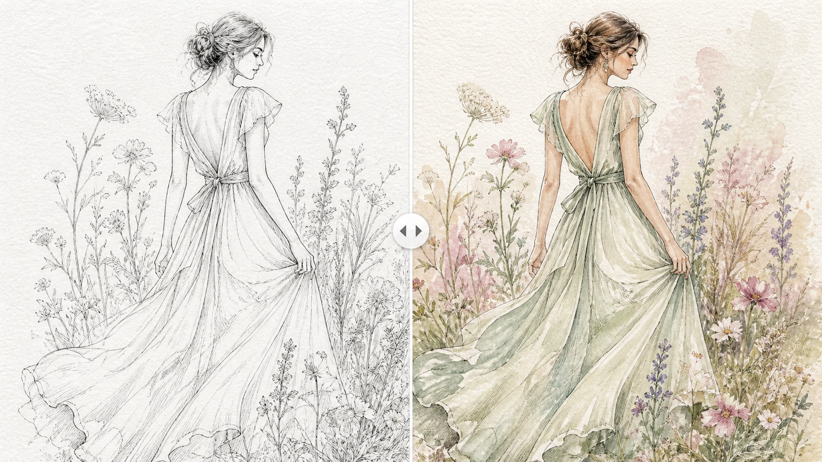
Fill Style
- Flat Color: even color regions and minimal tonal complexity; ideal as a base for later painting.
- Cel Shaded: flat color plus defined shadows; suited to anime characters and cartoon products.
- Watercolor: softer edges and translucent-looking color transitions; useful for loose sketches and handmade subjects.
- Pastel: light, gentle, lower-contrast color; suitable for children's art and lifestyle concepts.
Line Art mode also includes Line Protection, Background, and Shading controls. For a clean product or design drawing, try Strict + Flat Color + Original. For a loose pencil sketch, test Balanced + Watercolor + Soft.
Illustrations & Art Mode: Preserve or Reinterpret the Original Medium
Illustrations mode assumes that the source already contains meaningful artistic texture. The key decision is whether color should respect that existing surface or push it toward another rendering language.
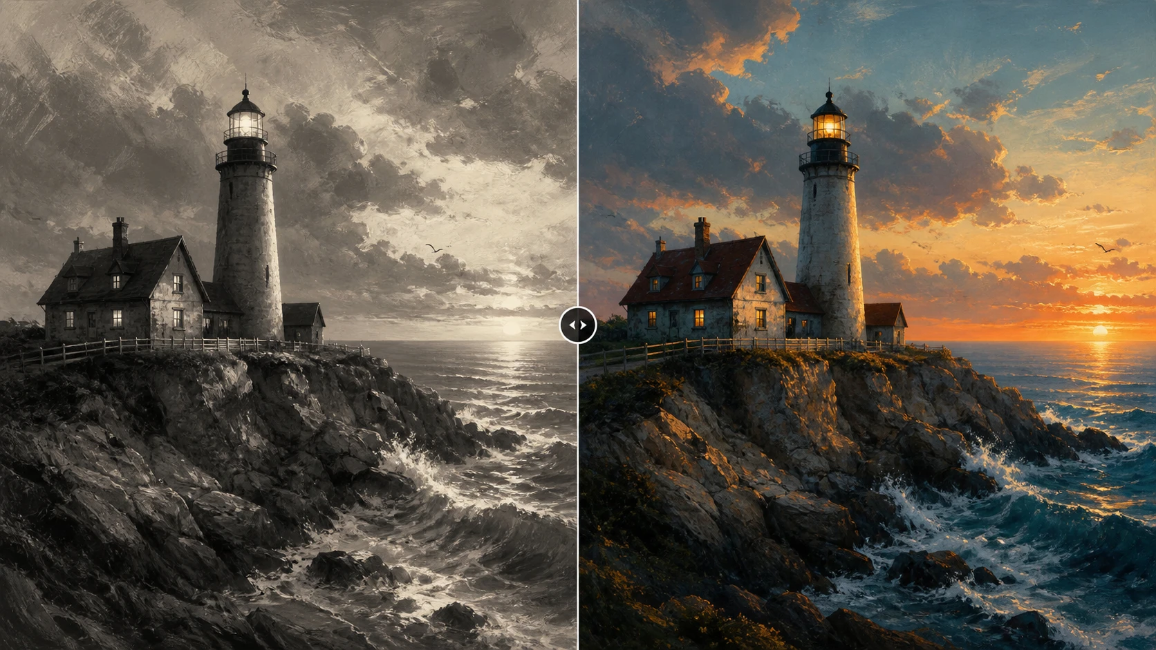
Artwork Type
- Digital Art: digital painting, grayscale rendering, or polished digital illustration.
- Traditional Art: pencil, watercolor, oil, ink wash, and other physical media.
- Concept Art: character, environment, film, or game development artwork.
- Children's Art: simple shapes, young-audience illustration, and children's drawings.
Palette and Rendering Style
This mode uses the same Natural, Vivid, Warm, Vintage, Cinematic, and Pastel palettes as Photos, then adds four rendering choices:
- Preserve: keeps existing brushwork, texture, and rendering character as stable as possible.
- Painterly: increases visible color blending and painted surface character.
- Watercolor: favors transparent-looking layers and paper-like texture.
- Cel Shaded: pushes the result toward clear graphic shapes and anime-style shadows.
Lighting
- Preserve: retains the source image's existing light-and-shadow relationships.
- Naturalize: makes lighting and color temperature feel more consistent with a natural scene.
For a finished grayscale artwork, start with Preserve rendering + Preserve lighting. This limits the number of variables changed in the first result. Use Naturalize when the original sketch has weak or inconsistent lighting.
Color Guidance: Automatic, Describe Colors, or Reference?
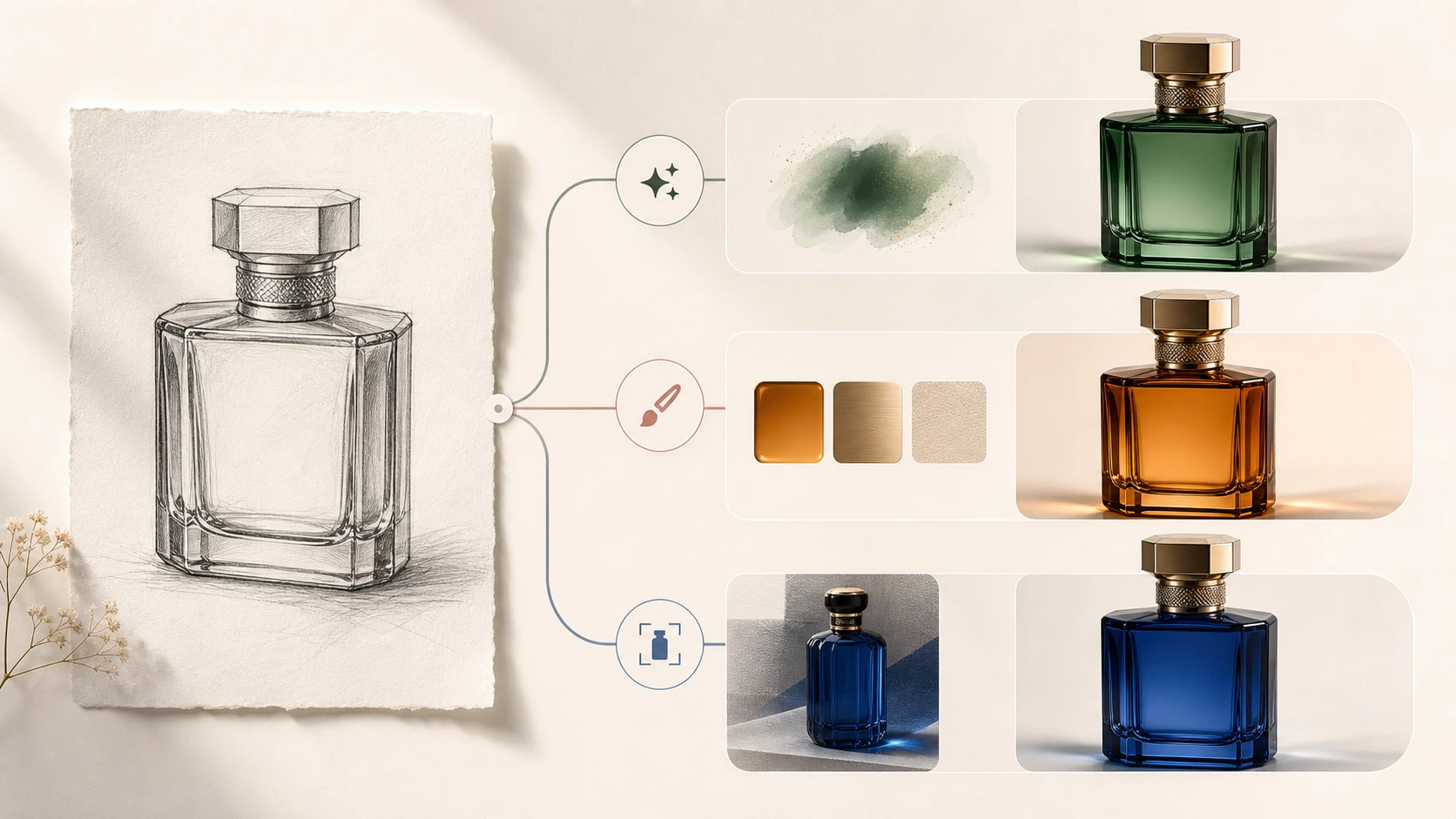
The best AI colorizer setting is often the least complicated one that expresses your actual requirement. Start automatically, then add either a written brief or a reference—not every control at once.
Automatic
Automatic lets the model infer plausible colors from people, objects, materials, and the scene. It is the right first pass when:
- You do not have verified historical or character colors.
- You want a fast, natural-looking result.
- You need to evaluate the selected content mode and style.
- Exact product or wardrobe colors are not important.
Its limitation is uncertainty. The model can create a convincing navy jacket even when the real jacket was brown.
Describe Colors
Write prompts as subject + color + material + light. Concrete instructions are easier to follow than broad moods.
Photo example:
natural skin tones, dark auburn hair, ivory cotton shirt, navy wool jacket, warm afternoon light
Manga example:
black hair, amber eyes, dark green school uniform, warm skin tone, pale blue classroom background, clean cel shading
Product example:
matte forest-green bottle, brushed silver cap, neutral gray background, soft studio lighting
Limit the first prompt to three to five important relationships. A request combining warm cinema, cold blue shadows, pastel softness, vintage printing, and neon light gives the model competing directions.
Reference
Reference uses another image to guide the corresponding main subject's colors. It is designed to leave the source pose, background, composition, and overall lighting independent rather than copying the entire reference scene.
Use it for:
- A recurring character with an established palette.
- The same product photographed from another angle.
- Clothing or uniform consistency.
- A sequence of related manga panels or illustrations.
For more reliable results, use a clear, normally lit reference with the relevant subject visible. Similar viewing angles make color correspondence easier.
Reference is a dedicated workflow. It does not combine with scene presets, filters, and user color notes, which reduces conflicting instructions. EModel does not offer this mode. GPT Image 2 exposes it for supported photo, line-art, and illustration workflows, while Nano Banana 2 provides the corresponding path for manga.
If only one color remains incorrect after processing, use the AI Photo Editor for a local correction instead of repeatedly regenerating the entire image.
PNG vs. JPG vs. WebP
| Format | Strength | Best use | Limitation |
|---|---|---|---|
| PNG | Lossless edges, text, and line detail | Manga, line art, design drafts, and later editing | Larger files |
| JPG | Small, widely compatible photo files | Photographs, previews, and social publishing | Lossy compression and no transparency |
| WebP | Strong quality-to-file-size balance | Websites and blog images | Not currently available with Nano Banana 2 |
Choose PNG for manga and line art unless file size is the priority. Choose JPG for normal photographic delivery. For a website, keep a PNG master and create a WebP publishing copy if your workflow supports it.
When a finished result needs a larger export, confirm the colors first and then upscale the colorized image. Upscaling too early can magnify color errors and edge artifacts along with useful detail.
Four Setting Recipes You Can Copy
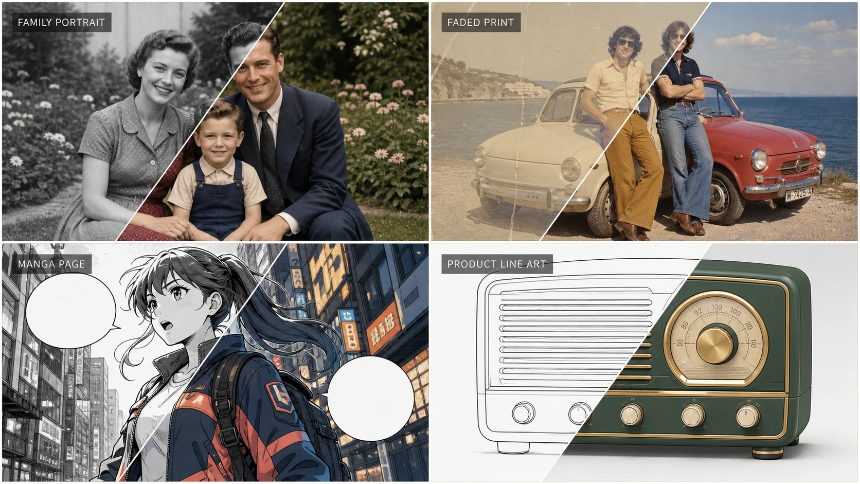
| Project | Recommended settings | Why it works |
|---|---|---|
| Family portrait | Photos → EModel → Portrait → Natural → Automatic → JPG | Fast, low-cost, and focused on credible people and skin |
| Scratched, faded print | Photo Restoration first; then Photos → Old Photo or Faded Photo → Natural/Vintage | Repairs damaged structure before asking the model to infer color |
| Manga page with dialogue | Manga → Nano Banana 2 2K → Cel Shaded → Strict → Colorize → Original → Preserve → PNG | Protects ink and text while producing a usable manga finish |
| Product line art with specified brand colors | Line Art → GPT Image 2 Medium → Object → Flat Color → Strict → Describe Colors → PNG | Supports material-specific instructions while preserving outlines |
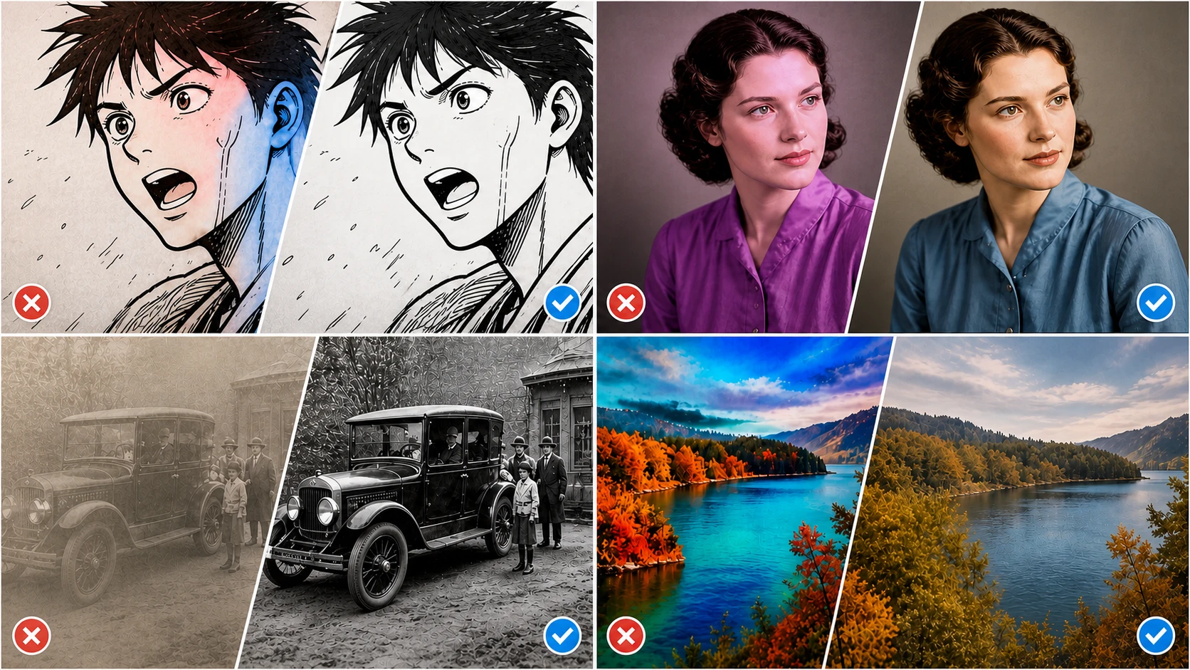
Common AI Image Colorizer Problems and the Settings That Fix Them
The face looks natural, but the clothing color is wrong
Automatic colorization is an informed guess. Switch to Describe Colors and identify the garment, color, and material—for example, “navy wool jacket.” Use Reference when a real sample or character sheet exists.
Manga ink is covered by color
Set Line Protection to Strict and begin with Original shading. Export as PNG. If the input has gray, noisy, or broken lines, clean the artwork before colorization.
An old photo still looks gray or muddy
Decide whether the image is truly black and white or a faded color print. Use Old Photo for the first case and Faded Photo for the second. Very dark and overexposed images provide weaker color evidence. Adobe's official Photoshop Colorize guidance also recommends improving brightness and contrast when poor exposure reduces color accuracy.
The background competes with the subject
In Manga or Line Art mode, choose Keep Monochrome. In Photos, replace Vivid or Cinematic with Natural and remove unnecessary environment-color instructions from the prompt.
The same character changes color between images
Use one consistent reference image and similar viewing angles. If using text, keep the same color, material, and lighting terms instead of rewriting them with new synonyms each time.
High quality does not solve the problem
Quality primarily affects detail and instruction-following. It does not automatically correct the wrong content mode or contradictory settings. Recheck the image category, subject type, line protection, background strategy, and prompt before spending more credits.
A Better Way to Test AI Colorization Settings
Change one variable at a time:
- Generate a baseline with the default model, the closest content type, and Automatic guidance.
- Decide whether the problem is global color, a specific object, line integrity, background treatment, or output detail.
- Change only the control related to that problem.
- Compare the new result with the baseline.
- Increase model quality only after the structural settings are correct.
This method makes the interface easier to learn and prevents unnecessary credits from being spent on combinations that cannot explain which setting improved—or damaged—the result.
Final Recommendation
An AI image colorizer works best when you make decisions in the right order: identify the image language, select a suitable model, create a baseline, and then add only the color control the project needs.
Natural and Automatic are often sufficient for family and documentary photography. Historical colors should always be treated as visual reconstruction rather than verified evidence. For manga, line art, and product work, clean edges, protected text, and repeatable subject colors are usually more valuable than maximum saturation.
EzEnhancer brings these paths into one browser-based workspace, but the controls are most effective when they solve a defined problem instead of being turned on simply because they are available.
Frequently Asked Questions
What is the difference between AI Image Colorizer and Photo Colorizer?
Photo Colorizer is a simpler automatic workflow for conventional black-and-white photography. AI Image Colorizer adds manga, line-art, and illustration modes plus style controls, text prompts, and subject reference colors. For an ordinary family photograph with no creative direction, the focused black-and-white Photo Colorizer may be the faster route.
Can it restore color in a faded color photograph?
Yes. Choose Photos → Faded Photo and begin with Natural or Warm. If the scan also contains tears, scratches, stains, or missing detail, repair that damage before colorization.
Does Reference copy the person or background from the reference image?
No. The workflow is intended to guide the corresponding subject's colors while preserving the source subject, pose, background, composition, and lighting. Important commercial work should still be reviewed carefully.
Which upload and output formats are supported?
The tool accepts JPG, PNG, and WebP source images and offers PNG, JPG, or WebP output. Nano Banana 2 currently excludes WebP output.
How many credits does one colorization use?
It depends on the model and level. The reviewed interface shows 5 credits for EModel, 6/10/20 for GPT Image 2, and 5/8/12 for Nano Banana 2. Confirm the live number shown on Colorize Image before submitting.
What is the best setting for realistic black-and-white photo colorization?
Start with Photos → Photo or Portrait → Natural → Automatic. Use Old Photo for an aged scan, Faded Photo for a color print that has lost saturation, and Describe Colors only when a specific object needs a known color.